10 Best Gray Paint Colors by Sherwin-Williams
The links in this post may be affiliate links. That means that if you click them and make a purchase, this site makes a commission. It will have no impact on the price you pay or the experience of your purchase.
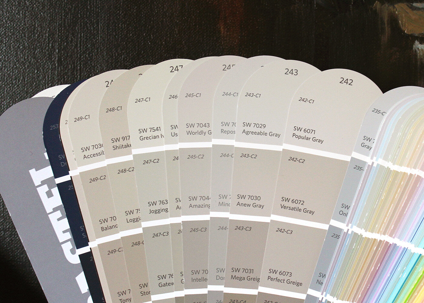
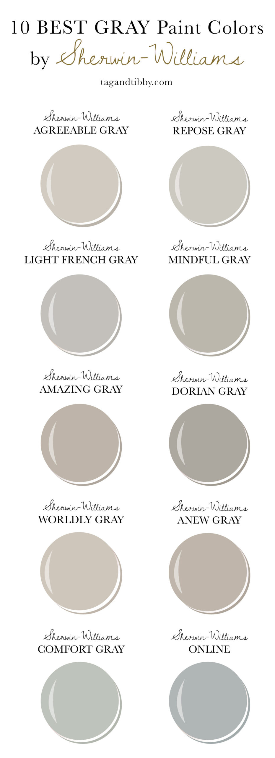
I spent hours researching the most popular Sherwin-Williams gray colors and narrowed it down to ten favorites. In this article, I share information about each paint color, swatches of each paint color, and the colors in rooms and on cabinets.
Looking to paint a room, cabinets, or doors gray? When it comes to finding the perfect shade there are hundreds of pale grays, dark gray, and darker shades of gray. It can be overwhelming to narrow down! Natural light plays a big role in how a color will look, the sheen of the paint, the size of the room, and what furniture you have in the space.
The goal of this article is to help you narrow down which paint color would work well for your home. While I worked hard to capture the swatches’ true color, the swatches below will vary some from the actual paint colors. Please visit your local paint store for paint samples before making your final decision!
Quick Tip: This article includes the RGB and LRV value for each paint color. RGB represents how much Red, Green, and Blue are in each paint color. On the LRV scale, O absorbs all light (black) and 100 reflects all light (white).
This article contains affiliate links. If you click a link and purchase an item, I get a small commission at no additional cost to you. Full disclosure here.
10 of the Best Sherwin-Williams Gray Colors
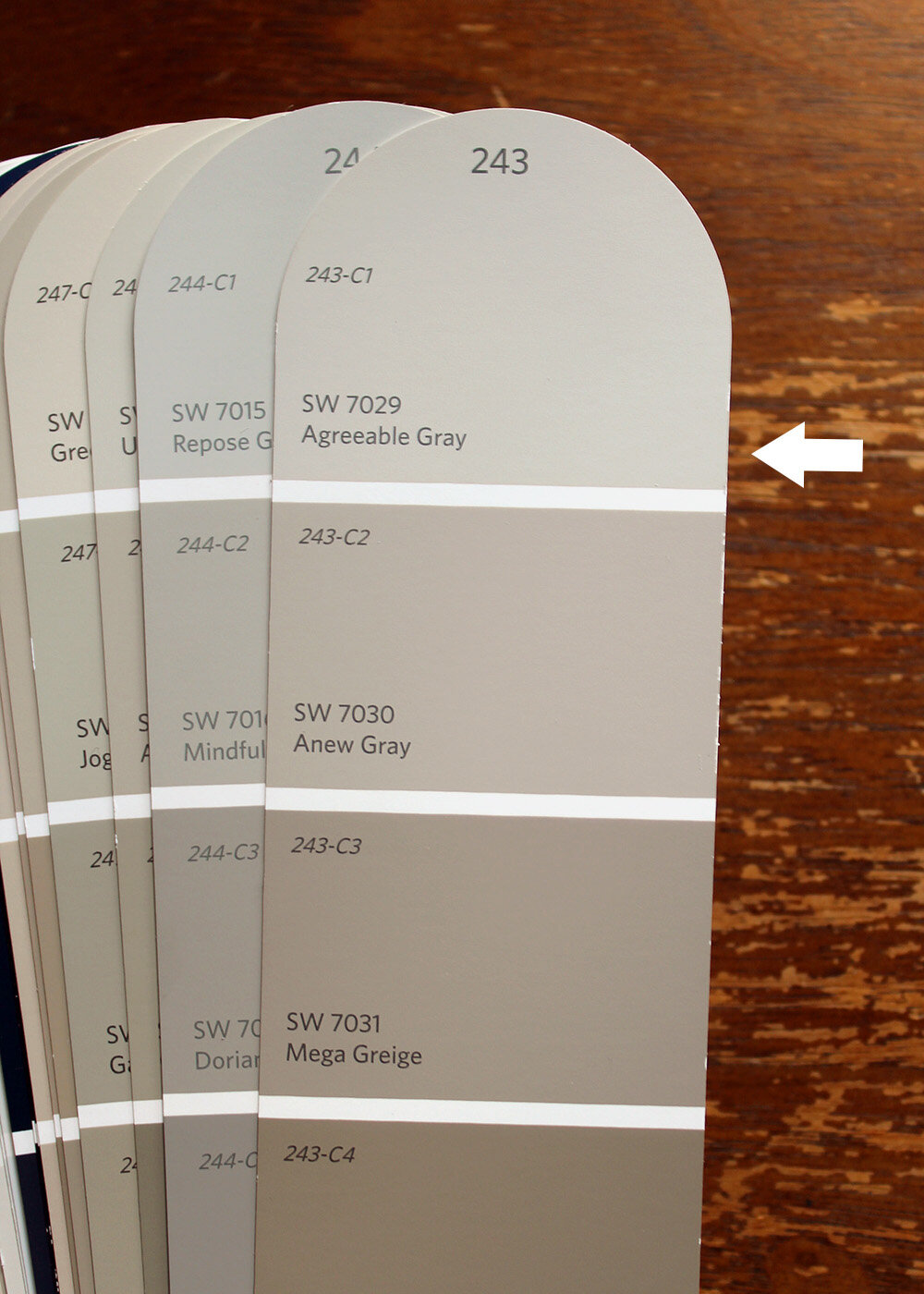
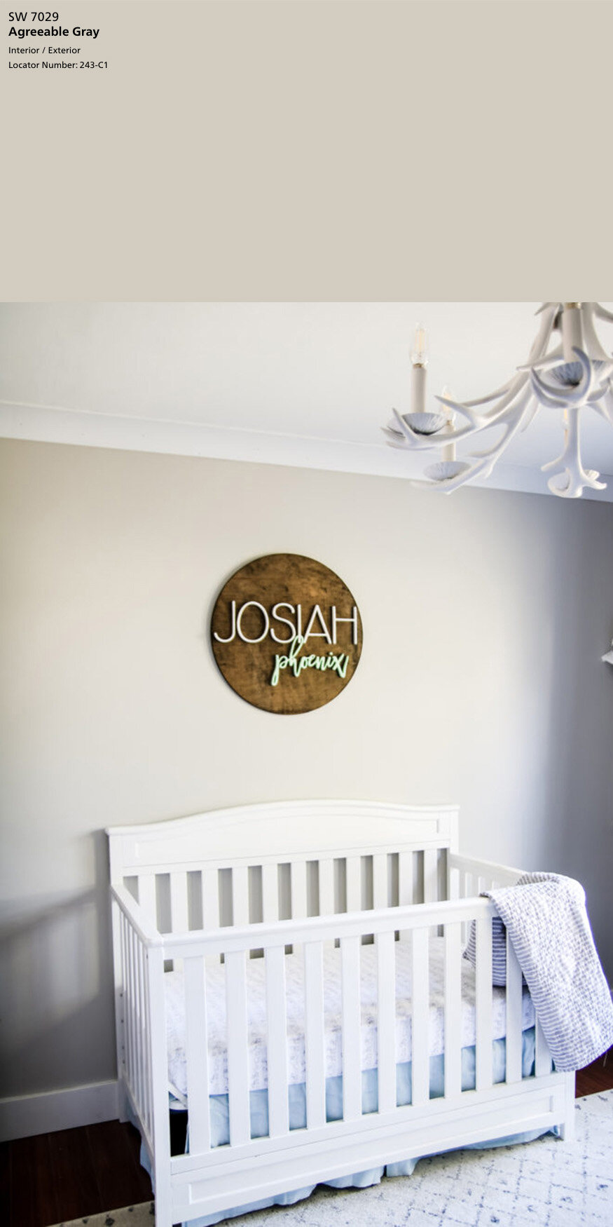
- Sherwin-Williams Agreeable Gray, SW 7029
SW Agreeable Gray is a very popular color choice and is a warm shade of light greige. If you are deciding between this color and Repose Gray, Agreeable Gray is the warmer color between the two.
R: 209 G: 203 B: 193 LRV: 60
below image source of Agreeable Gray in a nursery: Living Letter Home
below image source of Agreeable Gray in dining room: Green with Decor

2. Sherwin-Williams Repose Gray, SW 7015
SW Repose Gray is another popular color choice in the greige category, but a bit cooler than Agreeable Gray. It was a pick for the Pottery Barn Kids – Fall/Winter 2019 collection.
R: 204 G: 201 B: 192 LRV: 58
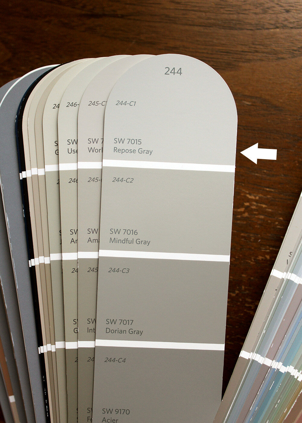
below image source of Repose Gray: Rain on a Tin Roof
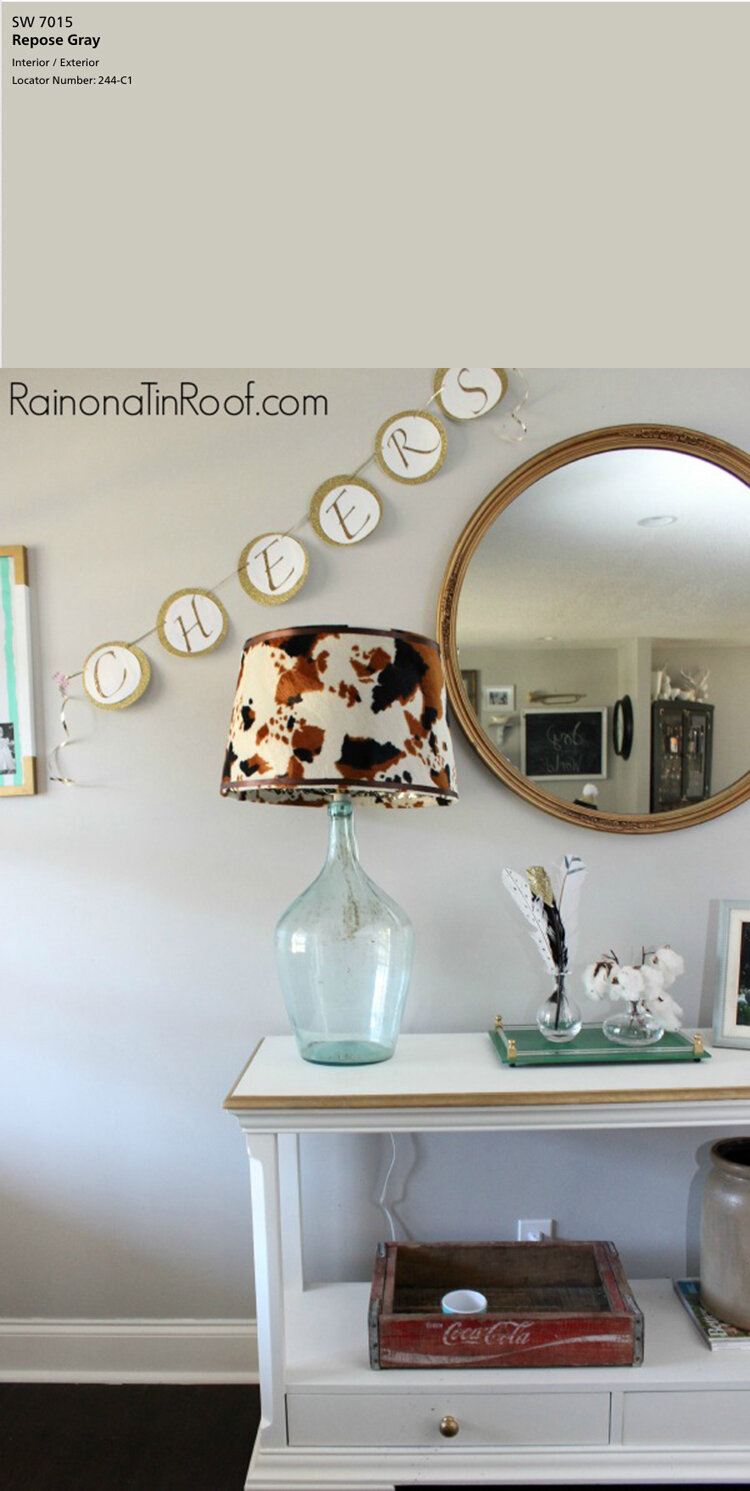
below image source of Repose Gray on cabinets: Table & Hearth

3. Sherwin-Williams Light French Gray, SW 0055
This color is a mid-tone cool gray with a slight blue undertone. SW Light French Gray is in the Historic Color Collection and is a good neutral option for interiors and exteriors.
R: 194 G: 192 B: 187 LRV: 53
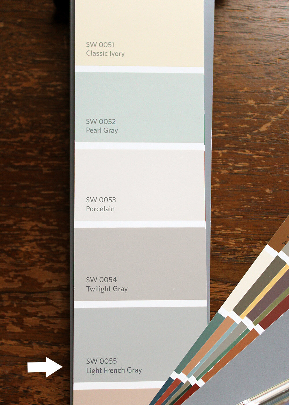
below image source of Light French Gray: Jennifer Allwood

4. Sherwin-Williams Mindful Gray, SW 7016
SW Mindful Gray is a shade darker than Repose Gray and a shade lighter than Dorian Gray. It stays on the light side of a mid-tone gray and shows beautifully against white trim and white furniture. This gray has a touch more red than green and blue but is overall neutral.
R: 188 G: 183 B: 173 LRV: 48
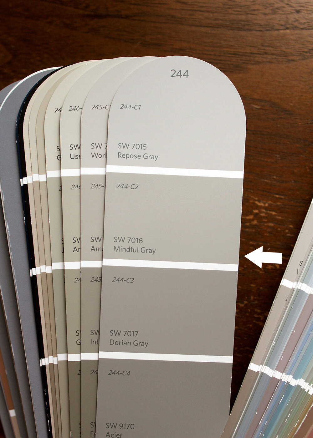
below image source of Mindful Gray in the bedroom: Sonya Barker
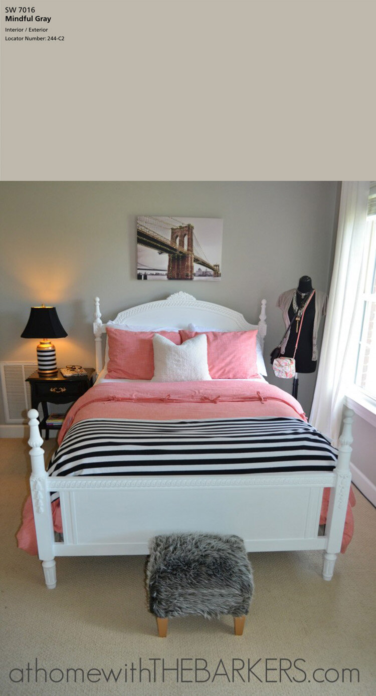
below image source of Mindful Gray on cabinets: Evolution of Style

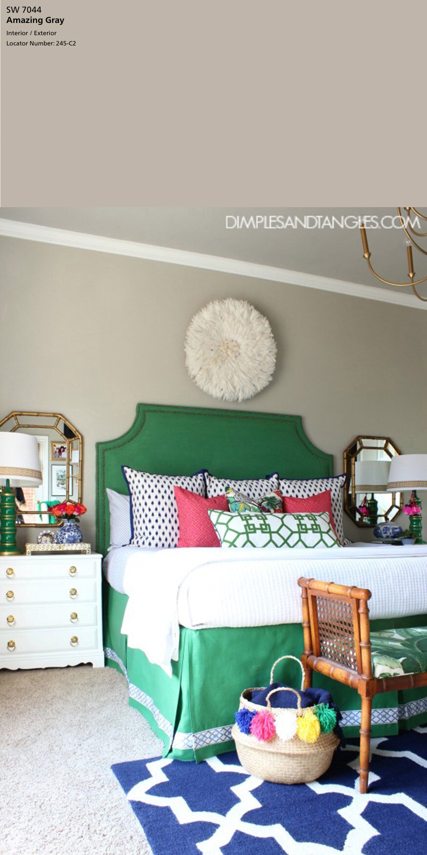
5. Sherwin-Williams Amazing Gray, SW 7044
SW Amazing Gray is a warm gray a shade darker than Worldly Gray. This color shows up well against white trim and is a solid choice for interiors and exteriors.
R: 190 G: 181 B: 169 LRV: 47
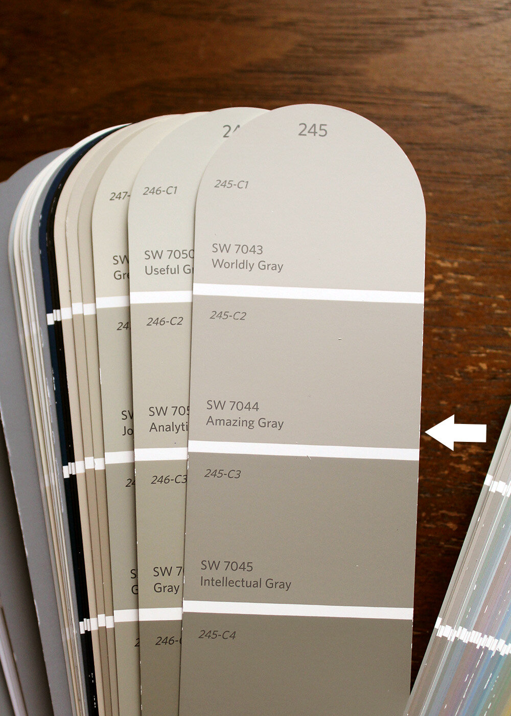
below image source of Amazing Gray: Dimples and Tangles
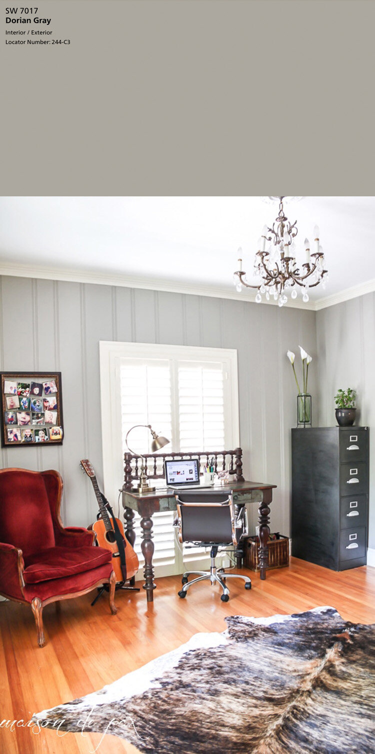
6. Sherwin-Williams Dorian Gray, SW 7017
SW Dorian Gray is a mid-tone gray one shade darker than Mindful Gray. Its greige tone is a popular color choice for cabinets and doors. Included in the PBteen Collection – Fall/Winter 2019
R: 172 G: 167 B: 158 LRV: 39
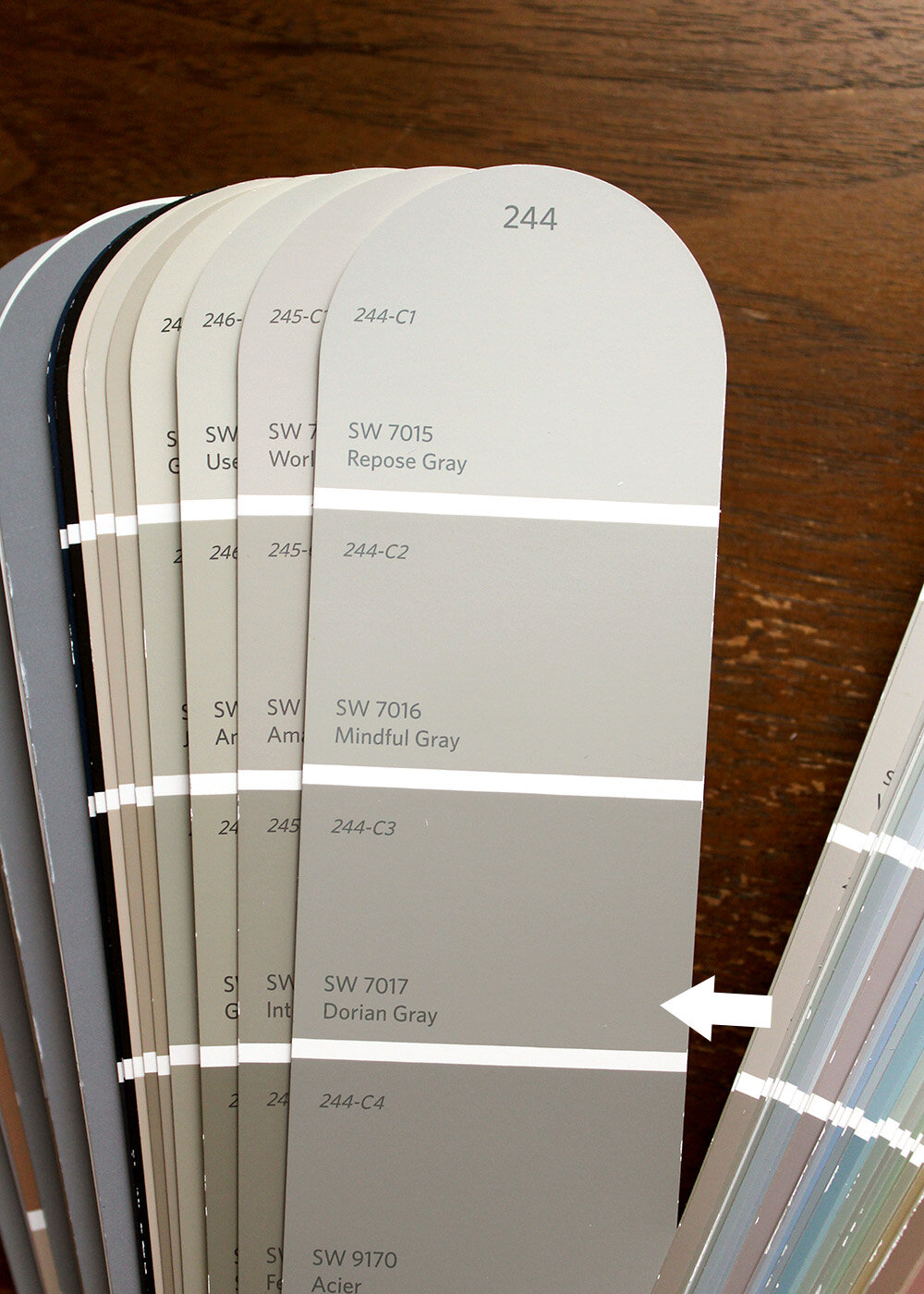
below image source of Dorian Gray: Maison de Pax (visit the link for more office pictures)
below image source of Dorian Gray on cabinets: Pink Peppermint Design

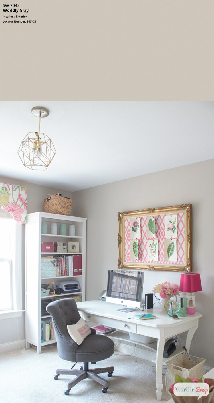
7. Sherwin-Williams Worldly Gray, SW 7043
SW Worldly Gray is a light warm gray, a shade lighter than Amazing Gray. It is a similar color to Agreeable Gray with a little more green in it.
R: 206 G: 198 B: 187 LRV: 57

below image source of Worldly Gray in office: Atta Girl Says
8. Sherwin-Williams Anew Gray, SW 7030
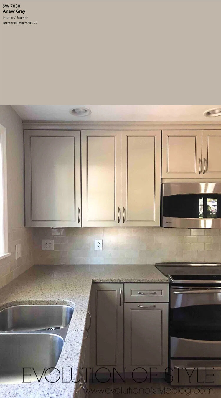
SW Anew Gray is a shade darker than Agreeable Gray and is between beige and gray (basically a warm greige). This color gives good contrast against white trim and is a good option for cabinetry.
R: 191 G: 182 B: 170 LRV: 47
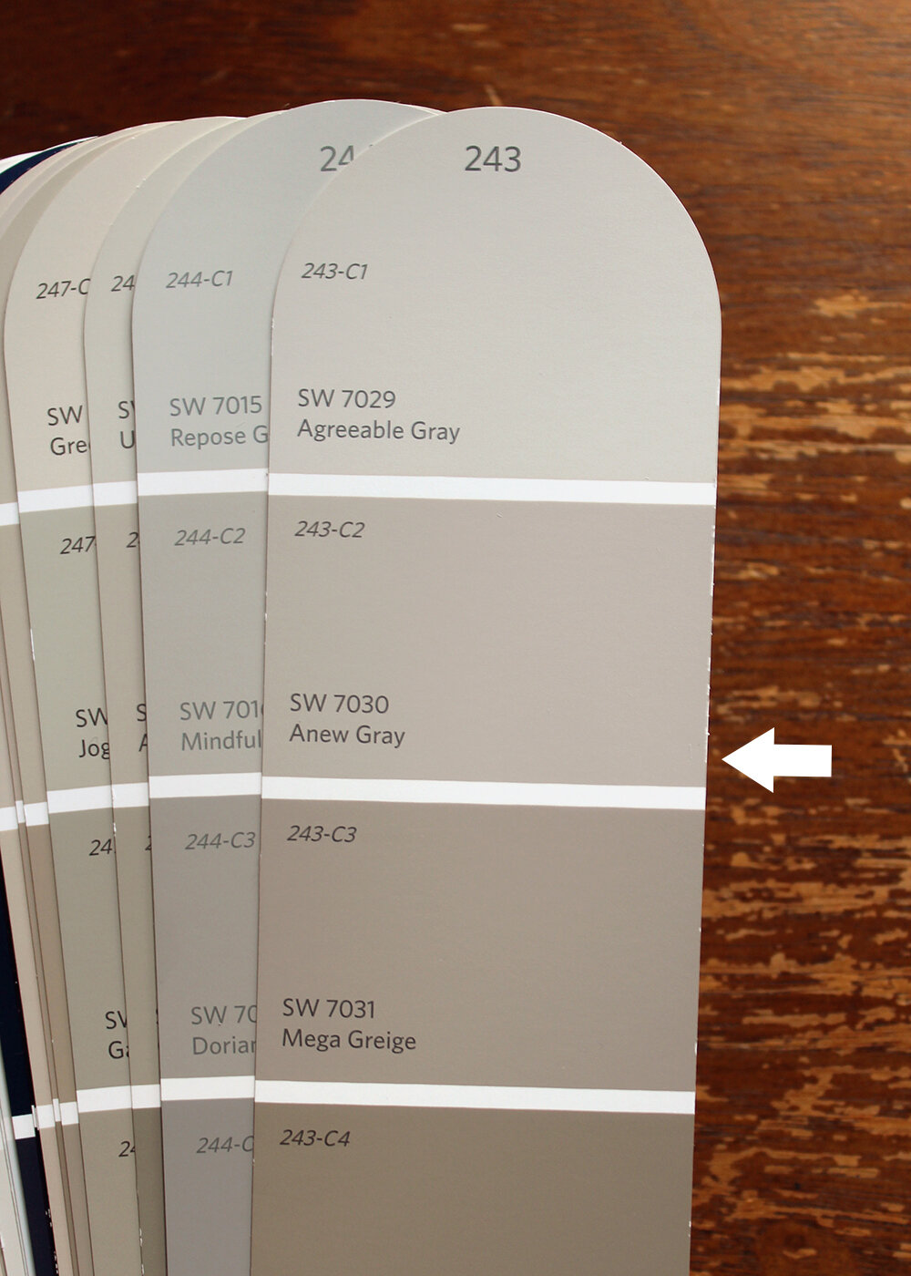
below image source of Anew Gray on cabinets: Evolution of Style
9. Sherwin-Williams Comfort Gray, SW 6205
SW Comfort Gray is in the green family one shade darker than Sea Salt. I selected this color for its blue-green vibe perfect for coastal decor.
R: 190 G: 195 B: 187 LRV: 54

below image source of Comfort Gray: Sand & Sisal

below image source of Comfort Gray: Home Stories A to Z

10. Sherwin-Williams Online, SW 7072
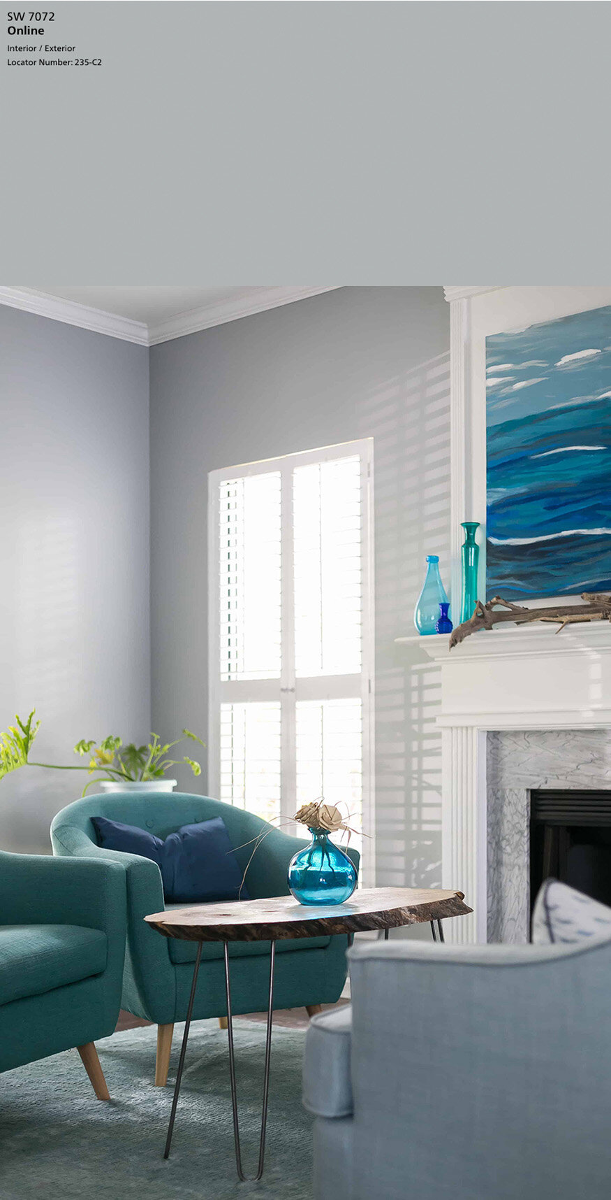
SW Online is a good cool neutral paint option. This color can show blue in some light and pairs well with cool or warm-toned furniture.
R: 176 G: 181 B: 181 LRV: 45

below image source of Online: Charleston Crafted
Samplize offers 12” x 12” peel and stick paint samples for Benjamin Moore, Sherwin-Williams, and Farrow & Ball colors. It is a fun way to test paint colors, and the material is flexible so you can wrap it around corners. I’ve ordered from Samplize for clients in the past, and we found the paint samples really helpful!
This article was written to help you narrow down the right color choice for your home–whether it is the perfect greige, a light gray, or in the neutral gray family. Gray paint can go warm or cool, and how it looks on a wall or cabinets will vary depending on how much light you get in a room.
Have you painted your home with any of these colors or have a favorite?



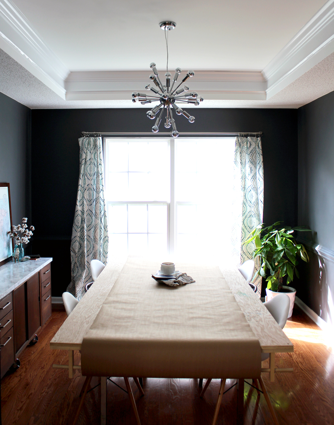

Our house is various shades of SW243 🙂 Our dining room is agreeable gray, our main rooms/stairs/hall are all mega greige and my youngest daughter’s room is anew gray. All three look so similar but I went with various shades based on the amount of light in the rooms. It’s actually hard to tell them apart, which is what I wanted. Oh and my trim is Snowbound, which I just saw is your kitchen. I love all of those colors together!
Love that combination! I was at a friend’s house recently with a similar blend of Agreeable Gray & Mega Greige. Does your paint show up neutral or more warm?
I would say it stays fairly neutral. Every once in a while in certain light it looks warmer, but it never looks brown. For us it’s a nice backdrop to pops of color elsewhere without being too light. I’ll shoot you a picture of the dining room once it’s done!
Beautiful colors! What color did you paint the ceiling?
Some of these are photographs of other designer’s rooms. I include a link directly above the picture with more info. Hope that helps!
Thank you so much for the time and effort it took you to make this post. I’m in the process of trying to figure out a gray for my kitchen cabinets. It is so hard because of small paint squares and how lighting changes what you think will work. But knowing what will go with white, as I want white subway tile and gray veining in white counter, will help greatly. Thank you again.
Crazy as it sounds, there is also a range of white colors (with countertops & tile). A virtual consult might be the best fit (more info here: https://www.tagandtibby.com/services). You could send me photos of the room and/or material names and after discussion I would give you specific recommendations.
I tend to lean toward blues more than greens but want to change things up with mild green in Comfort Grey in our main living areas. Would blue accessories (pillows, wall hangings) still work? Floors are gray, furniture is light neutrals and black.
What shade of blue are your accessories? I would add some pillows or drapes that have a pattern that ties in Comfort Gray, your blue, and a 3rd color like bright green or navy.
Wow! Three of my home’s paint colors made your list. I chose agreeable gray for my main house color. In my my well lit entry and stairwell it’s a lovely pale gray with a hint of warmth. It tends to look a bit warm in my darker family room. I have mid tone wood flooring throughout so either version looks intentional. My main bedroom and my son’s room are in online (as well as the laundry and powder room). It definitely reads blue in my home. I learned that when I began testing samples for grays a few years back. My daughter picked light French gray for her room and it looks lovely. I have the high reflective white for ceilings and trim which looks quite crisp
Your home sounds so lovely! Great choices. How does Light French Gray look on your daughter’s walls compared to Online, does it look lighter?